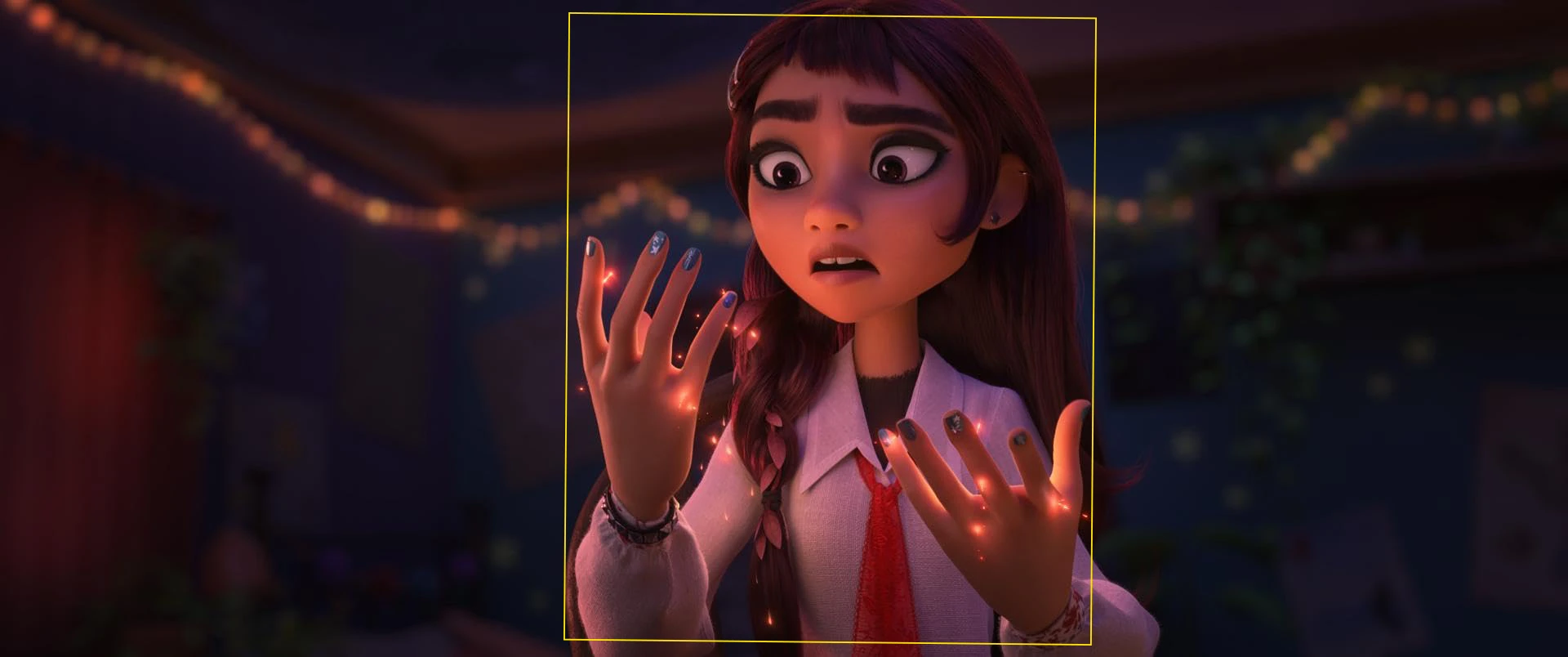
Disney's Hexed trailer is going viral for a reason that has almost nothing to do with its story. People are taking the widescreen footage, cropping it into a tall 9:16 video, and noticing that Billie, the magic, and much of the action still remain visible. The comparison has led to one direct question: did Disney frame the movie for TikTok, Instagram Reels, and YouTube Shorts?
Watch the teaser normally and the pattern is easy to notice. Billie is often placed close to the middle of the screen. Faces, magical effects, and other important details also stay near her. When a vertical crop removes most of the left and right sides, the main action can still be understood without much extra editing.
Hexed follows Billie, an impulsive teenager voiced by Hailee Steinfeld who discovers that she has magical powers. She enters the hidden witch world of Hexe with her mother Alice, voiced by Rashida Jones. The movie opens in theaters on November 25, but its first major online debate is already about how those characters are positioned inside the frame.
Why the Trailer Works in a Vertical Crop
A movie trailer is normally shown in a wide rectangle. TikTok, Reels, and Shorts use a tall rectangle instead. Turning one format into the other cuts away a large part of the image. If a character stands near the edge of the widescreen version, that character may disappear from the phone version. Hexed avoids that problem in many of its trailer shots because the person or action viewers need to see stays in the center.
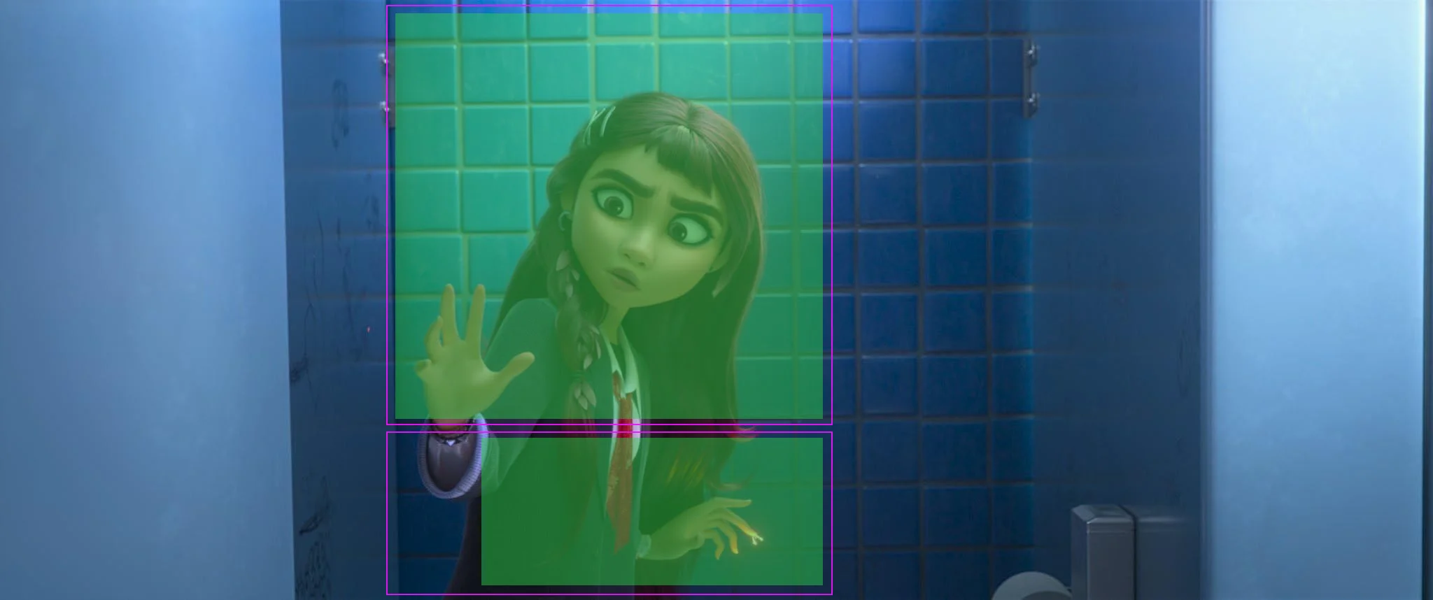
Centered framing was not invented by social media, and using it is not automatically bad. Movies have used centered faces, symmetry, and direct camera angles for decades. Animation also needs clear poses that children can read quickly. What caught people's attention here is how often the teaser returns to this setup and how little information is lost when the sides are removed.
This is where comparisons with older Disney animated films come in. Traditional Disney staging often moves characters across wide environments, places two people on opposite sides during a conversation, or uses background action to tell part of a scene. Those movies also center characters when a shot calls for it, so the comparison is not absolute. Viewers are reacting to the teaser's repeated choices, not arguing that Disney never used a centered shot before.
The teaser is still a small sample of a full movie. Trailer editors choose short shots that explain the character and premise quickly, and Disney's marketing team can choose footage that is easier to reuse online. That could make the trailer feel more phone-friendly even if the full movie uses wider compositions and more detailed staging.
What the Directors Said
Hexed directors Fawn Veerasunthorn and Jason Hand have rejected the idea that the movie was designed around vertical clips. During an interview with Cartoon Brew at the Annecy animation festival, Hand called the theory unexpected and untrue. Veerasunthorn said the team thinks carefully about every frame, including where Billie stands and whether a scene should make her feel free or restricted.
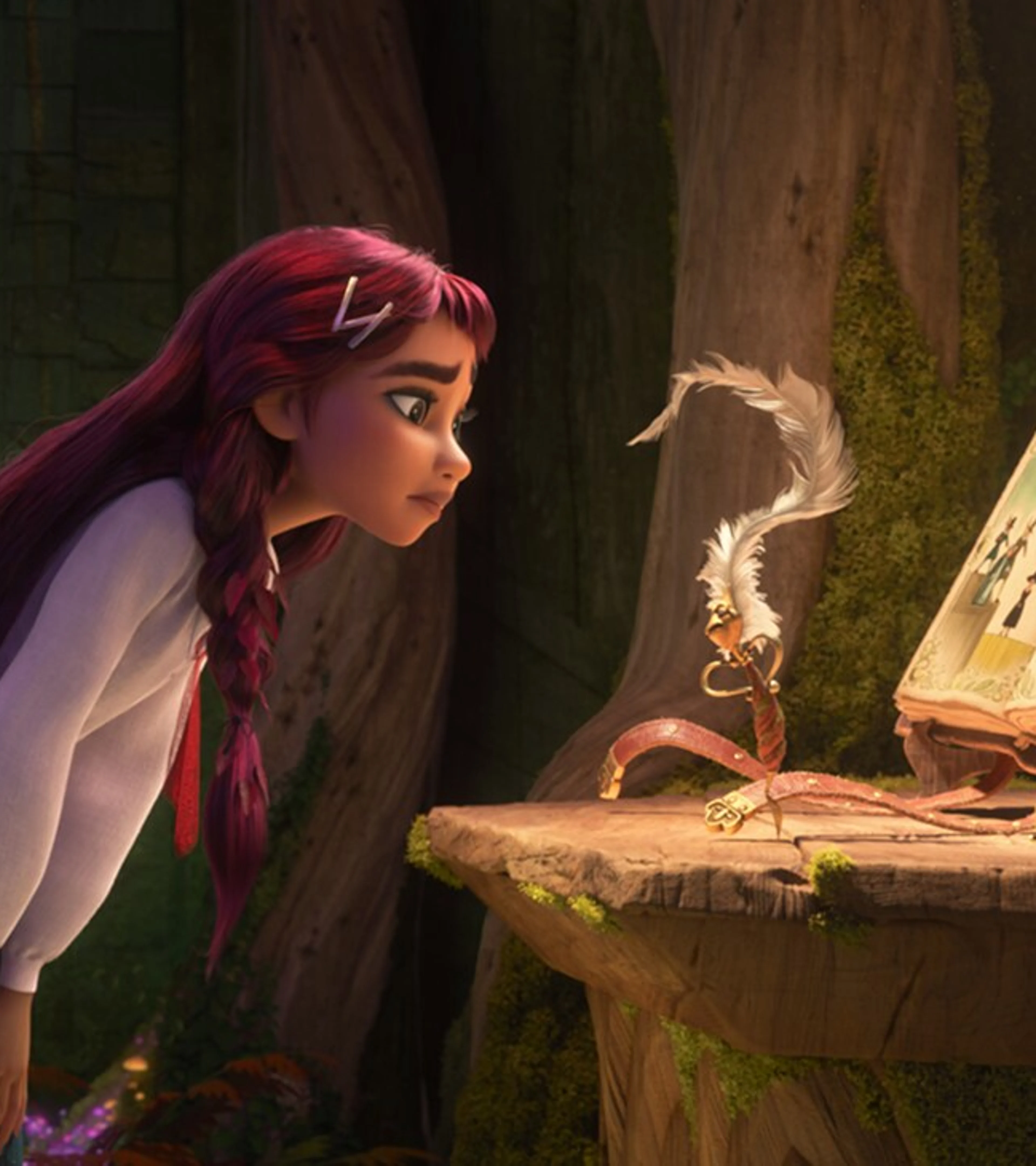
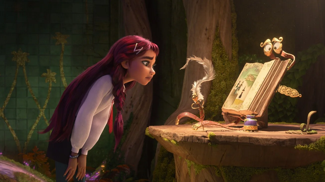
Other official images support their point. One still places Billie on the left while the magical book Elias Quire and Ms. Quill occupy the right side. A narrow center crop would remove important parts of that scene. It is a reminder that a viral edit of one trailer cannot show how every scene in the finished movie will look.
The directors' answer settles Disney's stated intention, but it does not make the audience reaction meaningless. The centered pattern is visible in the teaser, and the footage does crop unusually well for a phone. The most likely explanation is less dramatic: the movie was made for theaters, while the trailer was assembled from shots that also work well in social posts.
For now, the evidence supports a limited answer. The Hexed teaser is easy to turn into vertical video, but that does not prove the full movie was framed for a phone screen. When you watch it, does it feel cinematic or made for social media?