Godzilla Minus Zero did not need much footage to restart the conversation. Since Godzilla Minus One became the rare kaiju movie that broke out beyond longtime fans, expectations for the sequel have been unusually high. The newest teaser and images are short, cold, and built around one clear promise: Toho, the Japanese studio behind Godzilla, is not treating the follow-up like a simple celebration lap. The movie looks bigger, but the images still carry the same uncomfortable weight that made Takashi Yamazaki’s last Godzilla story land with people who do not normally rush into kaiju discourse.
The fresh official teaser hit YouTube on July 9, and Godzilla-Movies.com reported that Toho also surfaced new key art giving fans a cleaner look at the updated Godzilla design. The basics are already strong enough to explain why people are pausing every frame. Godzilla.com previously confirmed that Minus Zero picks up in 1949, two years after Godzilla Minus One, with Ryunosuke Kamiki and Minami Hamabe returning as Koichi Shikishima and Noriko Oishi. Yamazaki is back as director, screenwriter, and VFX lead, and the film is being positioned as the first Japanese production filmed for IMAX.
The interesting part is not only the monster design. It is the balance Toho is trying to strike. Minus One became a crossover hit because the spectacle had emotional weight underneath it, and every new look at Minus Zero is being judged against that memory.
The sequel still has to prove its story, but the first visual message is sharp: Godzilla is not being softened into a victory-lap mascot. He still looks like the problem everyone else has to survive.
The New Look Is Doing the Talking
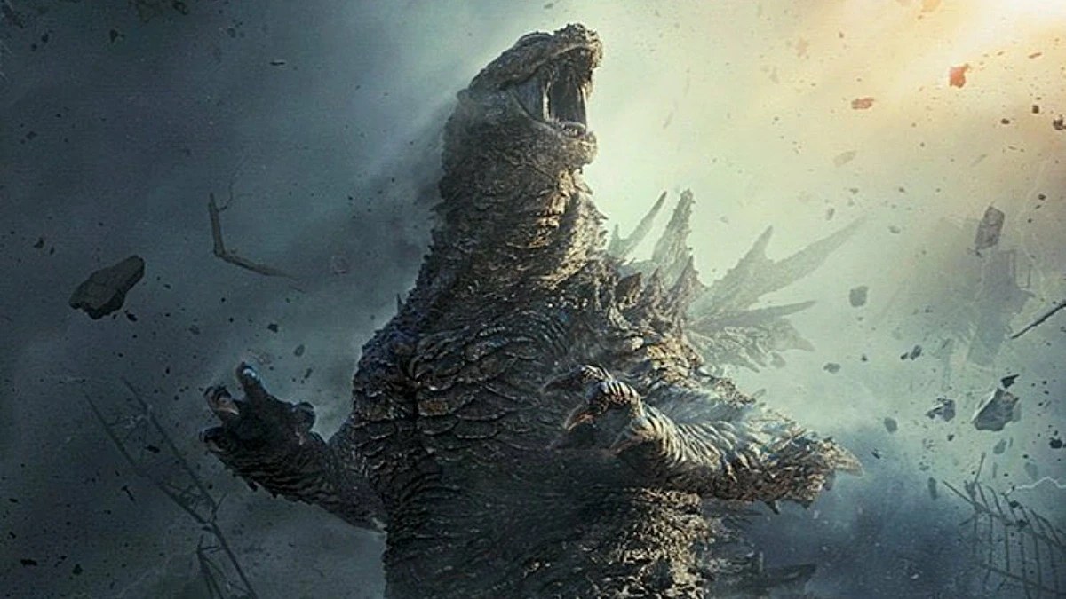
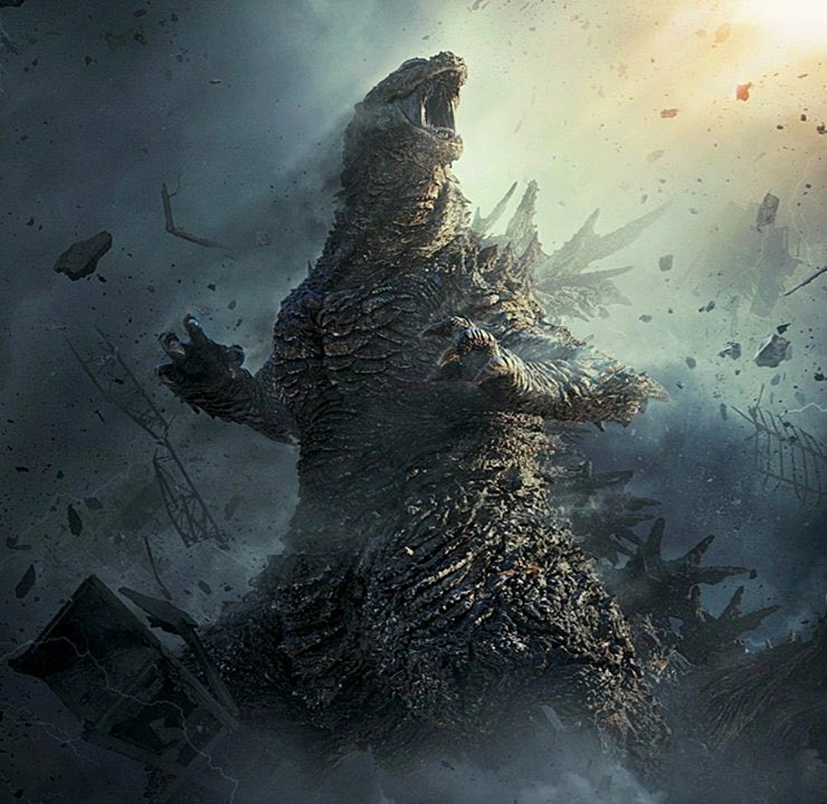
The clearest new key art sells a Godzilla with jagged dorsal plates, a battered surface, and a posture that feels less heroic than hostile. He is upright, huge, and readable from far away, but the body still has a roughness that keeps him from becoming a polished creature-feature icon. The debris around him helps too. It gives the image motion and danger instead of making it feel like a toy render placed on a cool background.
A sequel like this can easily chase a bigger roar and lose the thing that made the last movie sting. Minus One worked because Godzilla felt like the physical shape of postwar trauma, not just a famous monster showing up for applause. The new art suggests Minus Zero understands that people are not only asking, "How big is he?" They are asking whether he still feels impossible to survive.
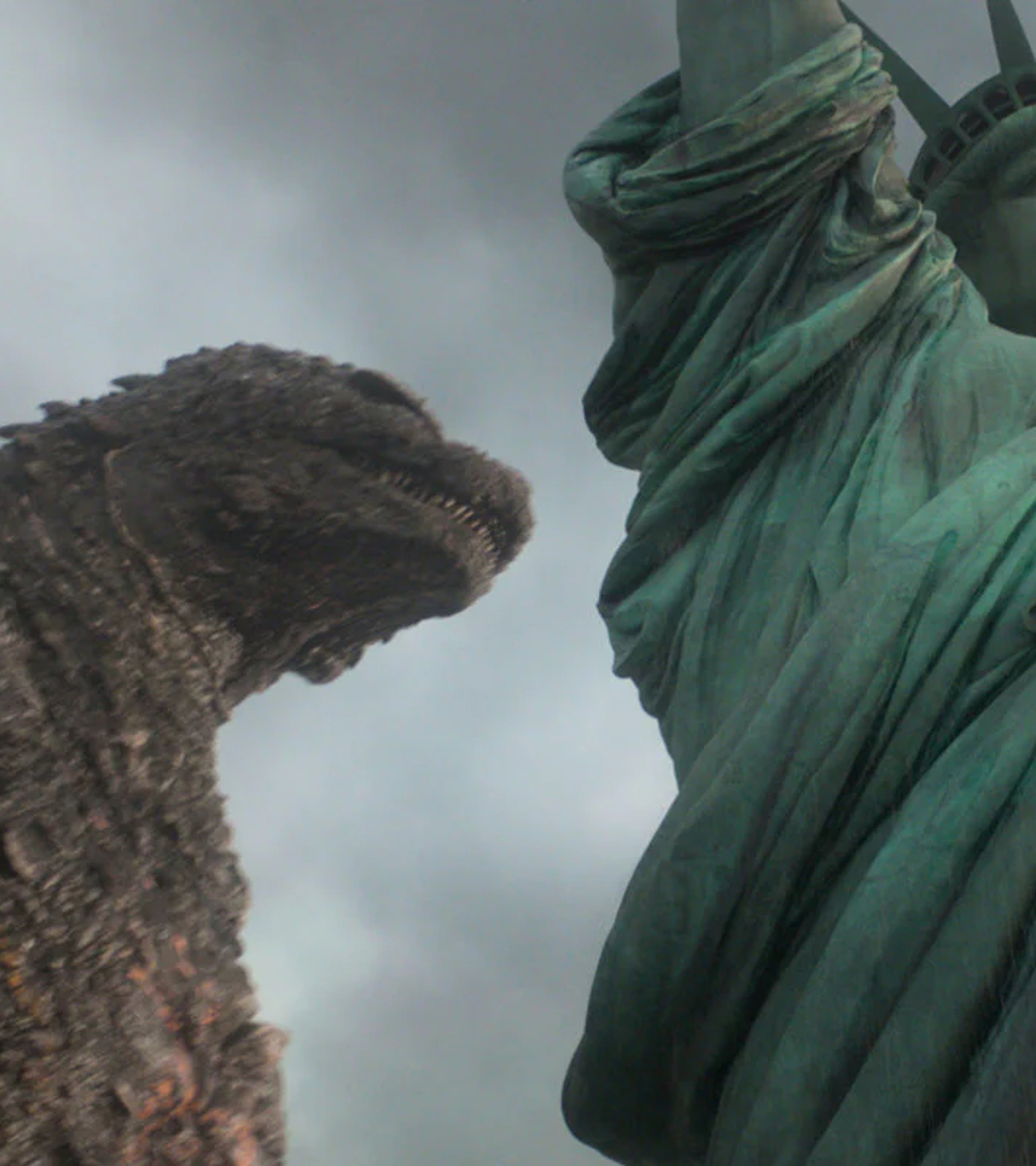
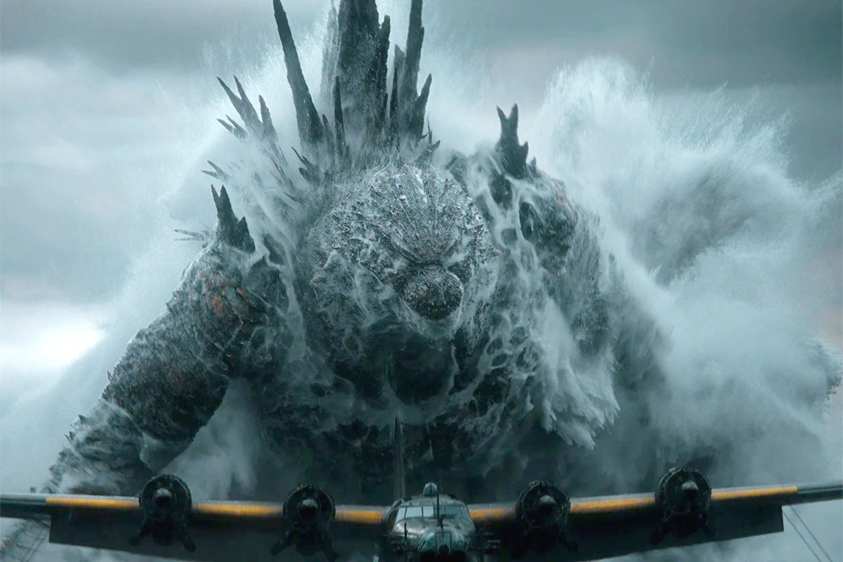
The Statue of Liberty image from the earlier official first look adds another layer. A Japanese Godzilla film using American iconography can easily tip into empty spectacle, but the image works because it is not colorful or triumphant. It looks gray, damp, and tense. The monster is not posing next to a landmark. He is invading the idea of safety the landmark is supposed to represent.
That choice also gives the marketing a cleaner hook than "the next one is bigger." Bringing Shikishima and Noriko back keeps the human thread visible, while the American imagery hints that the consequences may reach far beyond the characters who barely made it through the last disaster.
Fans Are Reading the Images Like Evidence
Godzilla fans always inspect design changes, but Minus Zero has a different pressure around it. Minus One is not just "the previous movie." It became the rare modern Godzilla entry that crossed over with casual viewers, awards voters, and longtime kaiju fans at the same time. The sequel now has to satisfy people who loved the monster spectacle and people who loved the restraint.
The new images give both groups something to hold onto. The IMAX framing and wider scale tell the spectacle crowd that this will not be a smaller repeat. The scarred texture, muted color, and heavy atmosphere tell Minus One fans that Yamazaki is still interested in fear rather than pure brand momentum.
For casual viewers, Godzilla still looks scary. Not cool in a collectible way, not glossy in a theme-park way, but scary in the old disaster-movie sense.